Modern CSS layout: grid, container queries and :has()
CSS has quietly absorbed features that used to need frameworks or JavaScript. A tour of the layout tools worth knowing now.
If your mental model of CSS layout is floats and media queries, you're missing the best part. The platform has caught up with what developers wanted for years.
Responsive grids without media queries
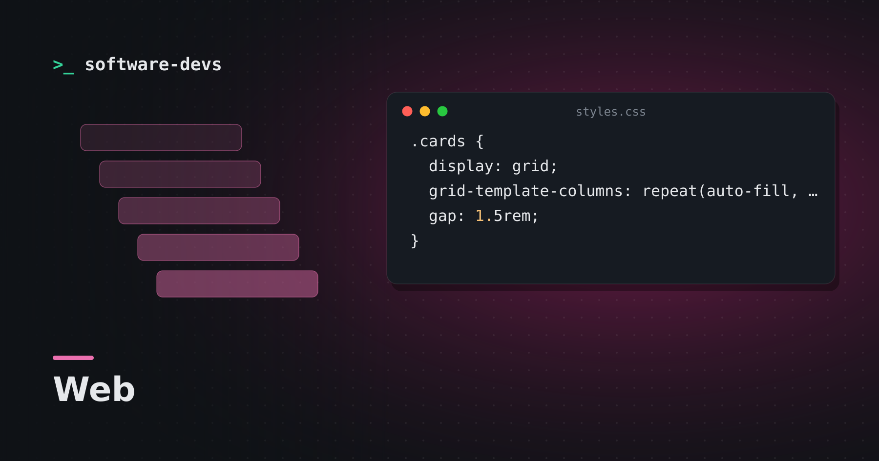
.cards {
  display: grid;
  grid-template-columns: repeat(auto-fill, minmax(260px, 1fr));
  gap: 1.5rem;
}
Cards wrap into as many columns as fit, each at least 260px wide. No breakpoints required.
Container queries
Media queries respond to the viewport. Components usually care about the space they have. Container queries make that possible:
.card-list { container-type: inline-size; }

@container (min-width: 500px) {
  .card { display: grid; grid-template-columns: 160px 1fr; }
}
The same card can be stacked in a narrow sidebar and side-by-side in a wide main column.
The :has() selector
A "parent selector" developers asked for for decades:
/* style a card differently if it contains an image */
.card:has(img) { padding-top: 0; }

/* highlight a form field's wrapper when its input is invalid */
.field:has(input:user-invalid) { border-color: crimson; }
Native nesting
.nav {
  display: flex;
  & a { color: inherit; }
  & a:hover { text-decoration: underline; }
}
Logical properties
margin-inline, padding-block and inset-inline-start adapt automatically to right-to-left languages and vertical writing modes.
Other quiet wins
clamp()for fluid type:font-size: clamp(1rem, 2.5vw, 1.5rem)aspect-ratioinstead of padding hackscolor-mix()for derived colorstext-wrap: balancefor tidy headlines- Cascade layers (
@layer) to tame specificity
What it means
Less CSS, fewer utility classes and less JavaScript for layout. Check your browser support targets, but most of these features are widely available in current browsers.